The React wrapper for Bulma that we always wanted

React-Bulma-Components is a library that will allow you to easily use all capabilities of CSS Bulma Framework using components in a declarative way.

<Form.Field>
  <Form.Label>Name</Form.Label>
  <Form.Control>
    <Form.Input placeholder="Username" name="name" value={form.name} onChange={update} />
    <Icon align="left">
      <i className="github" />
    </Icon>
  </Form.Control>
</Form.Field>
<Form.Field>
  <Form.Label>Password</Form.Label>
  <Form.Control>
    <Form.Input placeholder="Password" name="password" type="password" value={form.password} onChange={update} />
    <Icon align="left">
      <i className="github" />
    </Icon>
  </Form.Control>
</Form.Field>
<Button.Group>
  <Button fullwidth rounded color="primary" onClick={() => console.log(form)}>Login</Button>
</Button.Group>
feature

Responsive

Use a clear and declarative way how you want the layout to be on each breakpoint the each breakpoint property. Define Size, Offset, and other properties per breakpoint without any css.

feature

Fast & Modular

Include only components that you need reducing the size of your final bundle out of the box. With almost no external dependencies each component renders really fast.

feature

Fully Typescript friendly

Every component include a typescript definition to allow type support for each prop. PropTypes are also availables.

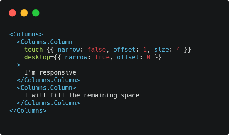
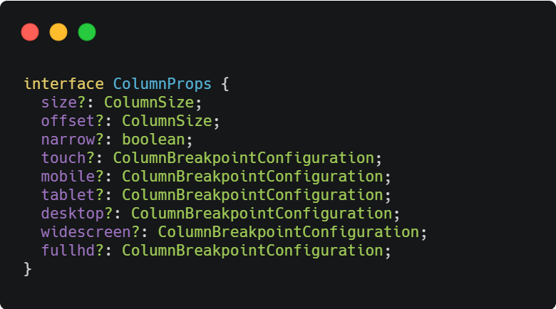
Simple 12 columns system

On mobile the columns stacks

1
2
3